


Produce Made Simple
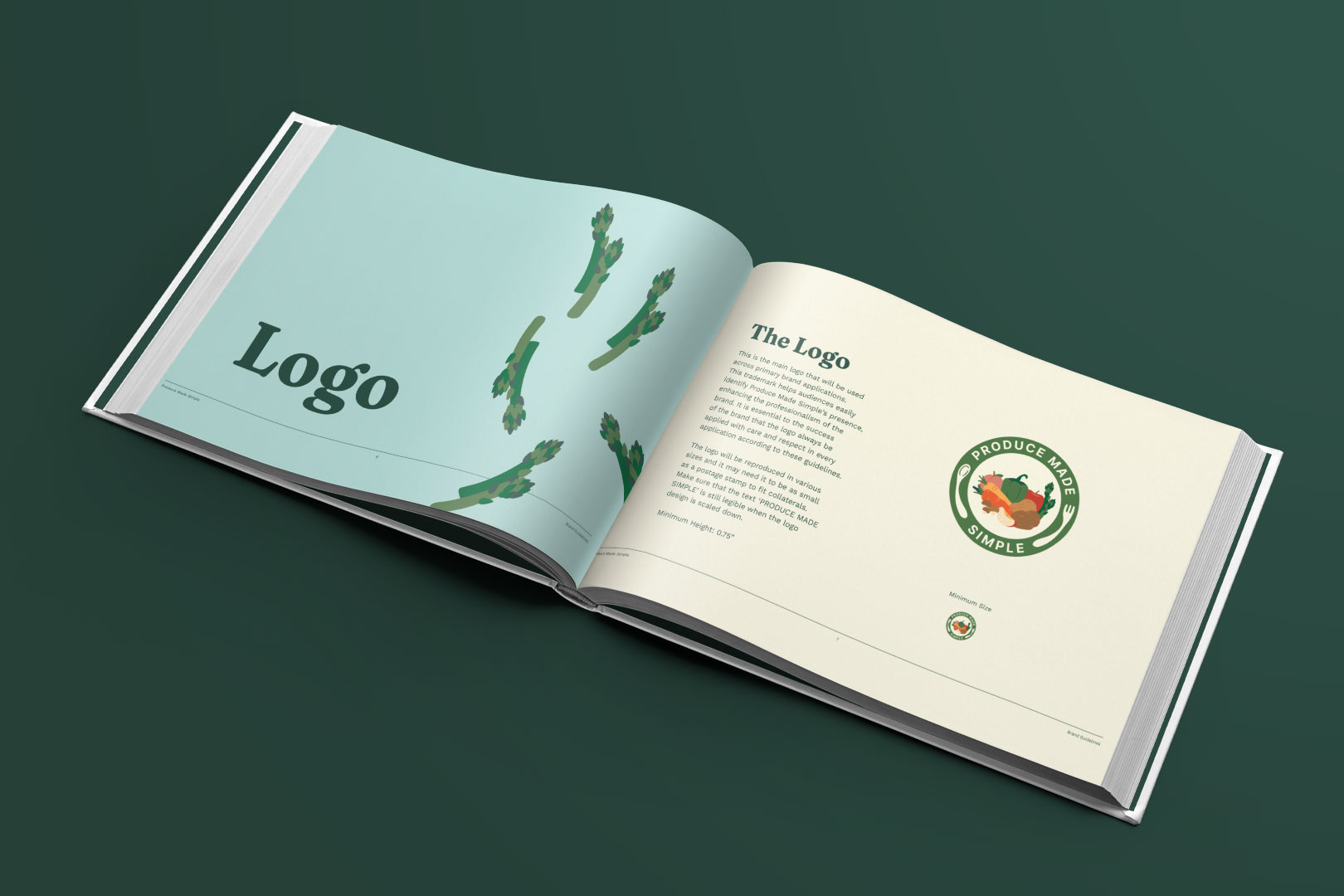
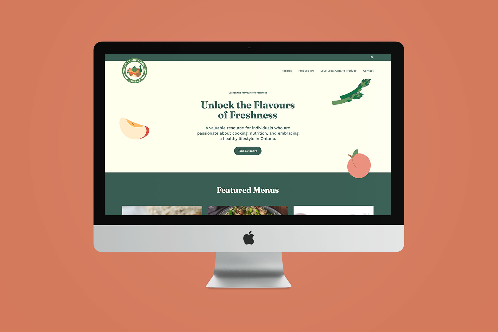
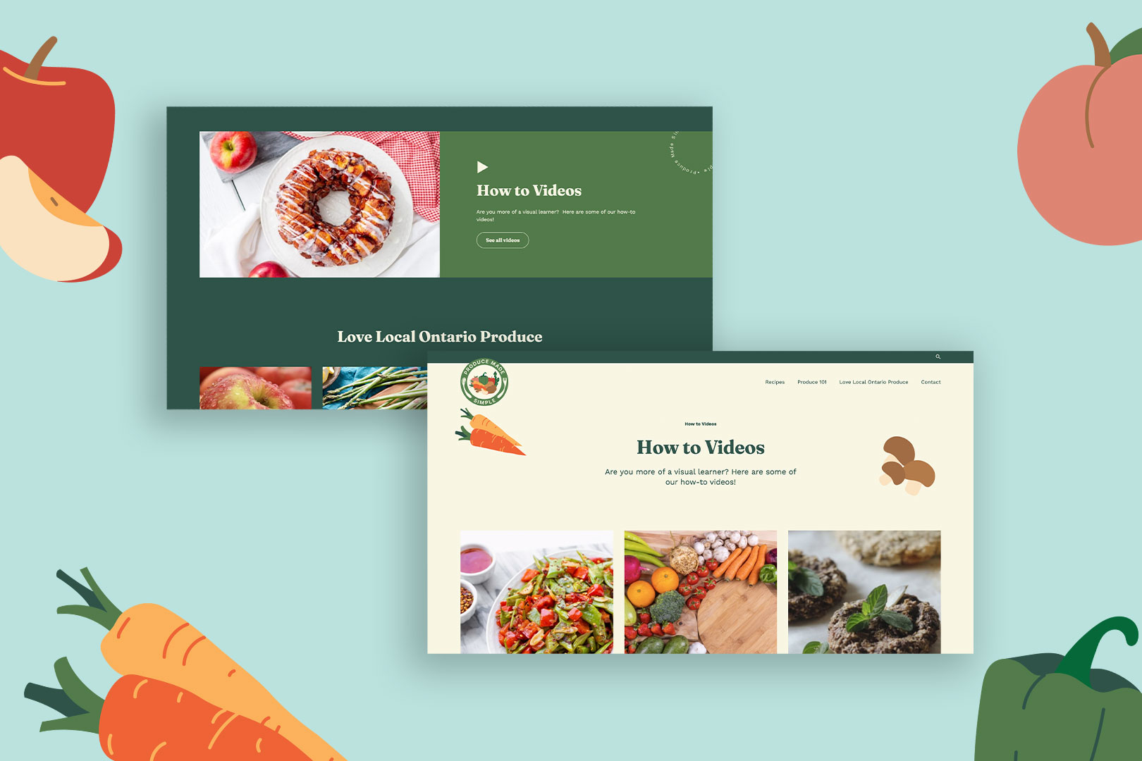
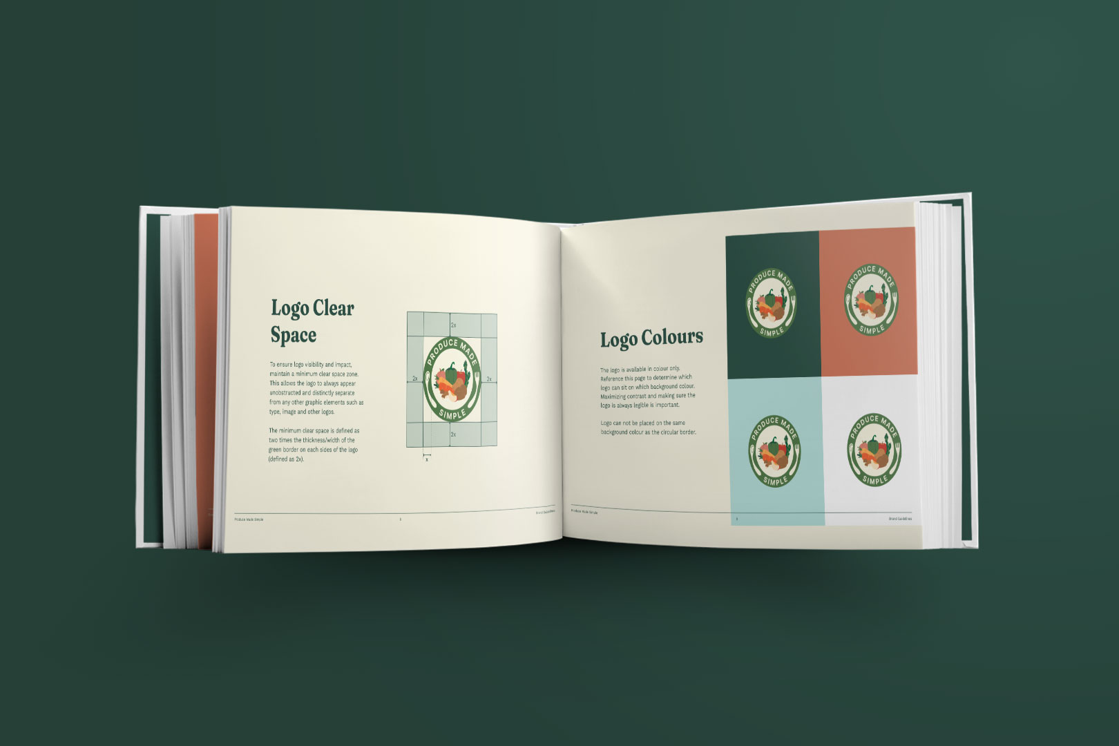
Produce Made Simple is a highly successful consumer facing platform run by The Ontario Produce Marketing Association, featuring an extensive website filled with recipes and educational content. The brand faced a challenge with an outdated identity and ineffective communication, and Nomad Cre8tive responded with a comprehensive rebrand. The circular logo, featuring a fork and spoon on a plate of diverse fruits and vegetables, symbolizes a decade of growth and a renewed focus on supporting local growers in Ontario. The vibrant color palette, inspired by local produce, reflects energy and commitment to healthy, sustainable eating. Font selection balances an educational tone with friendly boldness. This redesign not only modernizes the visual identity but also aligns closely with ‘Produce Made Simple’s’ core values, inspiring a community passionate about accessible, nutritious, and locally sourced produce.
Industry: Agriculture
Services: Branding, Website Redesign
Team: Aina Kawamoto, Anna Huang, Ynah Pantig, Wendy Ly, Ritish Rhurana, Johann Ferrera, Desiree Desmarais